

Having made hundreds of websites over the last 17 years (and many prior to that as a youngster in the 90s), I know a thing or two about what you need for your website homepage content. Content is one of the things that business owners struggle with the most. And for most people, writing about yourself is hard. However, your website’s homepage is often the first point of contact for visitors, so it’s really important to make a strong impression and guide them effectively. The content you should put on your website’s homepage can vary depending on your goals, industry, and audience, but here are some key elements and types of content to consider when deciding on your website homepage content.
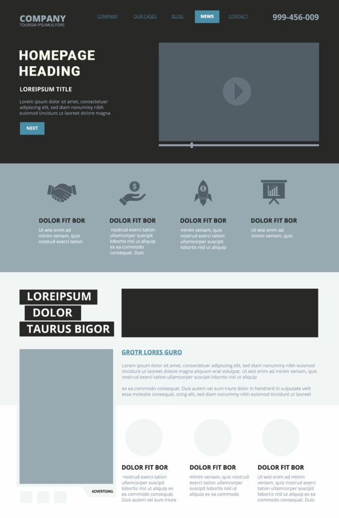
Above the Fold Homepage Content
Have you heard the term “Above the Fold” before? This is a term borrowed from the newspaper industry and is commonly used in website design and user experience (UX) to refer to the portion of a web page that is visible to a user without them having to scroll down. In other words, it’s the content that appears on the screen when a web page first loads, before the user starts scrolling. There are several items that need to be on your website above the fold, but that’s all of your website homepage content.
Clear Branding:
Your homepage should prominently display your company logo and name to establish your brand identity. The colors, fonts, and logos should coordinate with any physical branding you have – it should match your signs, your print materials, your vehicle wraps, etc. If it doesn’t, you run the risk of people thinking they have landed on the wrong website when they are specifically looking for you.
Navigation Menu
Include a clear and concise navigation menu that helps users easily find their way around your website. Use logical categories and labels. Don’t try to hard to be unique or flashy. If people can’t find their way to the content you want them to see, they won’t. People don’t want to work hard to learn about your business. Make it easy. Users expect the navigation to be at the top of the page, in a way that makes it easy for them to find what they want to read. Remember, they didn’t land on your site by accident, something led them there. Don’t make them leave because they can’t figure our how to navigate.
Featured Content
Below the navigation is where your featured content goes. What is featured content? It is the content that is the most important information you want your users to see. If you had to select just one thing, just one tidbit, one piece of information that you want your website users to read, what would it be? This is what you should put at the top of your website below your navigation.
- Value Proposition: Clearly communicate what your website or business offers and why it’s valuable to your target audience.
- Call to Action (CTA): Encourage visitors to take specific actions, such as signing up for a newsletter, making a purchase, or contacting you. Always give your users an option to take action right at the start of their time on your website.
Often times the featured content is displayed over a hero image. A hero image is a large, visually striking, and typically prominent image or visual element that is placed prominently at the top of a web page or the “above the fold” area. The purpose of a hero image is to capture the viewer’s attention, create a strong first impression, and communicate key messages or themes about the website or the content below it.
Hero images are great for grabbing attention, but be sure that your content is still easy to read over the top of the image, which may include adding an overlay to the image or adding highlights/shadows to your text.
Do NOT add a slider
On a regular basis, I do still have clients ask for sliders on their homepage, and the reason they ask for sliders is because they can’t decide what is the most important message they want to present to their site’s visitors, so they think a slider is a way to accomplish that because they can have several messages or pieces of content. But here’s the thing about sliders… almost nobody will see the content in the slides that come after the first one. Most people will view the first slide, a few will see the second slide, and no one will see all the slides.
If you have content you don’t want anyone to see, put it as the 4th slide in a slider.
Of course, no one wants that. So avoid the slider and pick a definitive message that you want your users to see.
Below the Fold Homepage Content
Don’t think your website is done just because you have decided what goes above the fold. Many people, but not all, will scroll down your homepage and see more of your content so you need to plan strategically to make that content work for you.
If you had trouble deciding what your primary message/information was that you wanted to share, then this is your place to add those additional bullet points. Do you offer other services or products that you want people to see? Add a row with two or three boxes to highlight your next most important content.
Other Homepage Content to Consider
Testimonials and Reviews: If applicable, showcase positive testimonials or reviews from satisfied customers or clients to build trust and credibility.
Latest News or Updates: If your website frequently publishes new content or has important news, include a section that displays the latest posts or updates.
Contact Information: Make it easy for visitors to get in touch with you. Include contact details like a phone number, email address, and a contact form.
About Us: Provide a brief overview of your company, including its history, mission, and values. This can help visitors understand who you are and what you stand for.
Social Media Links: If you have active social media profiles, link to them so visitors can connect with you on other platforms.
Search Bar: If your website has a lot of content, consider adding a search bar to help users quickly find what they’re looking for.
Newsletter Signup: If you have a newsletter, offer visitors the option to subscribe. Collecting email addresses can be a valuable marketing tool.
Special Offers or Promotions: If you have ongoing promotions or discounts, feature them prominently to entice visitors.
Trust Symbols: Display trust symbols, such as security badges, industry certifications, or partner logos, to build trust with your audience.
Remember that your homepage should be visually appealing, easy to navigate, and designed with the user in mind. Regularly review and update it to keep it fresh and aligned with your evolving business goals and audience needs.

Amy Masson
Amy is the co-owner, developer, and website strategist for Sumy Designs. She's been making websites with WordPress since 2006 and is passionate about making sure websites are as functional as they are beautiful.