

Almost anyone can find a DIY website program and get a website online with probably not that much effort. And it may not even look too bad, to be honest. I’ve seen a lot of these types of websites done by folks who want to save a few bucks on their online presence by doing it on their own instead of hiring a website designer.
If that’s you and you’ve done a new website you’re happy with, kudos to you! But I wanted to take a few minutes and share some important details from a professional website designer about your new website that people often miss, and can make a big difference to the user experience.
Don’t hide your phone number
If you have your phone number on your website, be sure it’s where people can find it quickly. This is especially important if you work in an industry where clients are likely to call you to schedule appointments, such as the medical industry, service businesses, and government agencies. A lot of times people will Google your business solely to find your phone number.
Put it at the top of your website on every page.
Make your phone number clickable
If you put your phone number on your website, it’s probably so someone can call you. But if someone is looking at your website on their phone, and you don’t make the phone number clickable, then they literally have to write down or remember the phone number and flip over to the keypad to call. If you want your users to call you, make it easy. Make that phone number clickable. Many phones will automatically detect that a phone number is a phone number and make it clickable for you, but not ALL phones do that. And if you use a JPG or other element for your phone number, then you must take the extra step to make sure it’s clickable for calls.
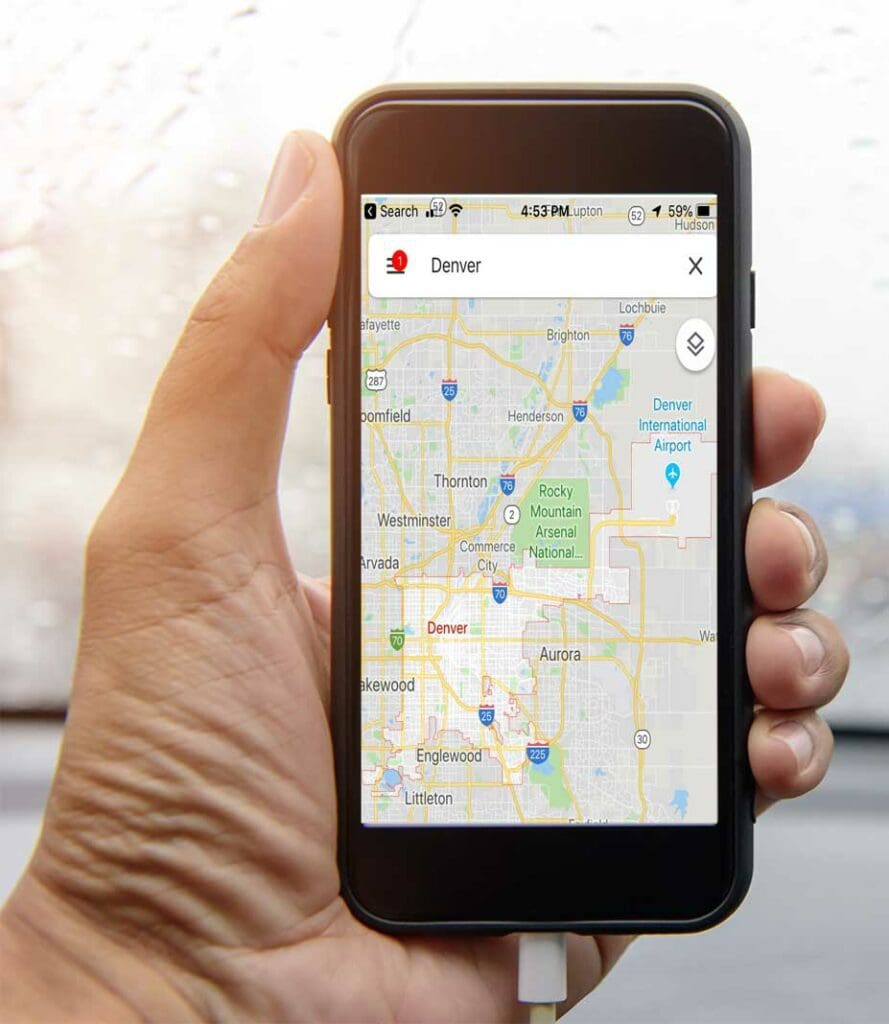
Also, make your address clickable for directions
If part of your website is having your retail location online, and you’d like visitors to come to your store or place of business, make that address clickable through to Google maps! If I’m on my phone looking at your website, and want to come to your location, if you’ve linked your address to Google Maps, I can click right on it and open up my Google Maps app and get step by step directions to your location.
This isn’t a big thing. It’s not hard or even impressive to do. But it’s a small detail that can increase the likelihood that someone will make it to your location.
Use link colors that stand out
If your text link looks just like your text, nobody will know to click on it. What’s the point of using a link in your text if people can’t tell it’s a link? The link color needs to stand out from the color of your text. It should make it super obvious that it’s a link.
Additionally, make sure your text links are underlined. Having a great stand-out color is important, but not all your users will be able to tell the difference depending on their visual abilities. Having it underlined it just another small way to make sure your visitors can find your links.
Scale your images
When using WordPress, you can upload your images with ease and put them right into your page. It’s so easy that most people don’t even think to resize their images before they upload them. Why would you do that, when you can just resize them right on the page?
Two words: Page Speed.
Cameras and phones take great photos these days, and those photos are HUGE. If you upload a huge photo onto your page it’s going to make your page take longer to load.
In fact, the best thing you can do for your page load is to upload your photo in the exact size and dimensions you need it, rather than uploading it directly from your phone or camera.
Avoid long paragraphs
People are skimmers. They probably have landed on your website because they are looking for specific information. Don’t bury that information in long pages of text.
Now, don’t take this the wrong way. I’m always harping on people to product more content, more content, more content. And I stand by that recommendation. But the way your content is formatted makes a huge difference in how much of it gets read. Look at your paragraphs. How long are they? How many sentences do they have? Can you rewrite it to be more concise?
- Can you use bold, italic, or quotes to break it up?
- Can you add lists?
- Can you insert images to add visual interest?
Don’t forget a favicon
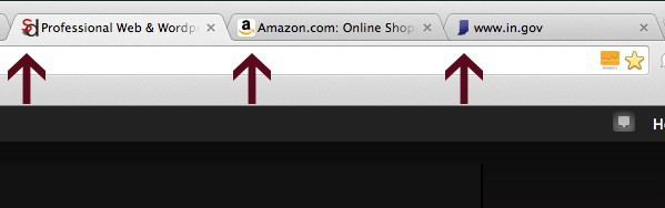
If you aren’t sure what a favicon is, also known as a site icon, it’s the teeny tiny little icon that shows up in your browser window next to your site’s title, that kind of identifies your website. For people like me who open a lot of tabs (and I mean a lot of tabs), having that icon makes it really easy to find my way back to a site I was on previously. It helps make mess of tabs less of a mess.
Make it easy for your site visitors to get back to your website by creating a customized favicon.
Open off-site links in a new window
There are going to be times when you need to link to another website. In fact, you should have outbound links on your website, they are important for many reasons. But do yourself and your visitors a favor by making sure those links open in a new window. That way, your users can get back to your site (hopefully easily because you put in a site icon).
Set a featured image
For every blog post and for at the minimum the homepage of your site, add a featured image. The reason? If someone shares your site on social media, the featured image is what gets pulled automatically into Facebook, Twitter, etc. If you don’t designate the image you want to go along with that page or post, then it will just pull the first image on the page and that’s not always putting your best foot forward. If you want to make sure you know what image gets shared with your post or page, designated a featured image. It’s super easy and makes a big difference for social sharing.
Customize your contact form message
With most forms, when you submit the form, there’s a short message letting you know that the form submission worked. By default, those messages say something along the lines of, “Your message has been received, we look forward to getting in touch.” And maybe that’s good enough for you.
But… adding a customized message really shows your user that you care about their message. You can add a few more sentences, include how to call you if they have more concerns, how long you expect it to take to get back to them, and even some helpful links that they may find useful. (I share a few popular blog posts and a search box to encourage users to stay on my site longer.)

These tips are all things that most professional website designers know and do as a matter of habit, but for those DIYers or newbies just getting started, may be something you miss. Don’t let your site miss these small but very important details.

Amy Masson
Amy is the co-owner, developer, and website strategist for Sumy Designs. She's been making websites with WordPress since 2006 and is passionate about making sure websites are as functional as they are beautiful.