

Let me clear about something at the start of this post. Everyone hates pop-ups. Everyone. Hates. Pop-ups. This is a fact that website owners need to know.
That may be the truth — and it is, a 2016 study found that people find them annoying, distracting, and creepy — but the flip side to that coin is that they can be effective. Notice I didn’t say are effective. They can be.
So I thought in today’s post we could take a deeper dive into the world of pop-ups and find out when they work and when they don’t, and what mistakes to avoid.
Why your pop-up is probably not working
It’s distracting
Most people, when planning their pop-up, don’t actually put that much planning into it. They add a pop-up plugin, type in their text and hit go. The pop-up shows up on every page of the site, no matter where you go or what you are doing, and it’s not always relevant to what the person who lands on your site is doing.
Asking people for a sale or subscribe before they trust you is never going to work. Chances are, if someone has landed on a blog post, it’s because they are trying to find specific information that you’ve written about. They want to read what you wrote. And then two seconds in they are hit with your pop-up, which distracts them from what they wanted to do before they even know if you have anything good to say.
Why would I want to subscribe to your blog before I know if your blog has anything worth reading?
That is when your pop-up becomes annoying and obtrusive. Not only will it likely not convert, but it also has a good chance of scaring away your visitor.
It’s rude
This is one of my biggest pet peeves, the pop-ups that ask you a Yes/No question that insinuates that you are stupid if you say no.
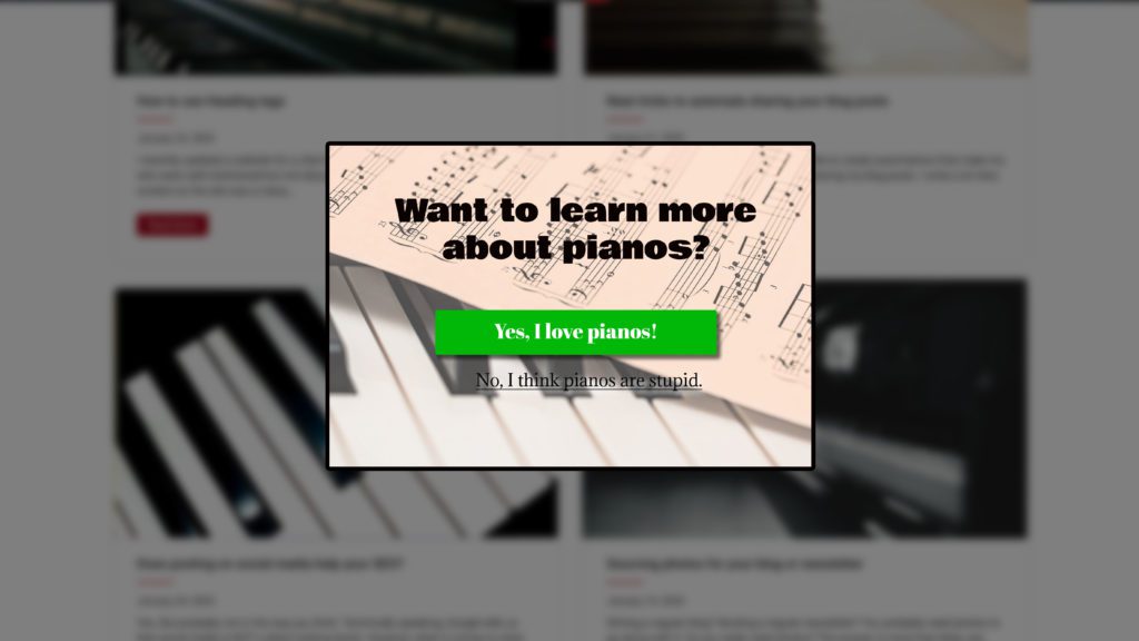
If I land on your site because I’m interested in what you have to say, and then I’m given a choice of either I love what you say and want to subscribe, or else I hate it all and think it’s stupid, that’s pretty insulting.
It’s not relevant.
Your pop-up will always work better if it’s relevant to what’s on the page. I’ve seen people do a lot of bad pop-ups over the years. Whatever is in your pop-up needs to be related to the content your website visitor is reading.
How to fix your pop-ups for better conversions
Fix the timing.
Start with timing. Don’t flash your pop-up in their face the minute they land on your site. Let them look around at your content a bit before you make them an offer. There are many different settings for pop-ups, it doesn’t have to be immediate. You can set them based on time on the page, amount scrolled, page views or exit-intent.
I am of the opinion that a pop-up will always do better if you have time to build your credibility with the person visiting your site first. This is particularly valid if they are reading a blog post. Don’t ask them to subscribe before they’ve even read your content!
That’s why I favor the exit-intent pop-up. This means the pop-up will only show when the user is showing signs they are about to leave your site. This is a no-lose situation, because they are already on their way out, why not offer them something?
Include a better offer.
The piano example above asks if I want to learn more about pianos, and if I don’t, then I think pianos are stupid. Which is a dumb pop-up to be sure, but even if I changed the wording to be less insulting, I’m still not offering the site visitor anything in exchange for subscribing.
Whatever you are offering to your visitor in your pop-up, it needs to be compelling. Just asking them to subscribe to a newsletter without a freebie, a coupon, or other incentive is doomed to fail.
Your content may be so compelling that I never want to miss a post, and if that’s the case, then congrats on being a fantastic writer. But most of us aren’t, so we need to make an offer that people want to accept.
One of the most compelling reasons I sign up for a newsletter when I see a pop-up? A really good coupon. If I’m on a shopping site, and I can get 20% off if I sign up, you bet I’m going to sign up.
Consider who your target audience is and what they are looking for, and then find something they want and offer it to them for free. You’ll convert more people with your pop-up that way.
Make it funny.
The truth is, humor works. Pop-ups are definitely less irritating and annoying when they make you laugh.
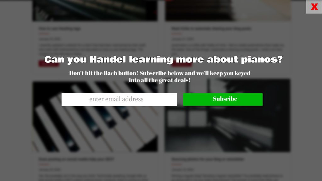
Ok, so maybe I don’t know much about piano humor, but you get my point. Funny pop-ups are going to perform better than bland ones.
Be sure it matches
Your pop-up should match your site. It should coordinate with colors, fonts, and it should look nice. The user should be able to tell that they are still on your site, so use an overlay and don’t block out the entire site in the background. If it looks out of place, like spam or an advertisement, it’s much less likely to perform for you.
Pop-ups can be successful if they are done well, but you can run away your customers if they aren’t. Plan your pop-up strategy with your target audience in mind and you’ll always have a better performance.

Amy Masson
Amy is the co-owner, developer, and website strategist for Sumy Designs. She's been making websites with WordPress since 2006 and is passionate about making sure websites are as functional as they are beautiful.
Yes, you are right !
That pop-up’s are annoying and irritate your website visitors if not designed properly to match your audience.
There are couple of ways this problem can be minimized.
1) Using personas to match your audience
2) Using relevant text and good offer
3) Blending colors with the website
4) Timing it properly
5) Doing A/B testing