

It’s inevitable that at some point, someone is going to hit an error page on your site. Even if you never changed it, never delete a page, or never change a permalink, people can get to error pages simply by having a typo in the URL they enter.
So that’s why it’s important to have a really great error page. By default, most error pages say something along the lines of:
The page you are looking for cannot be found.
And it has the main navigation and theme from the rest of the site. So most website owners just leave it at that as good enough. But, in my opinion, it’s really important to have a great error page. The hope is that it’s never seen, but in the event it does, it can make an impression on your user.
Side note – a fun way to check out examples of error pages is with political candidate websites. Go to their website, then add some random text to the end of the url. I think you can really tell the expertise of their web developer by what you see on the error page.
Anyway, a good error page is a great way to direct your users into an action. Telling them that the page they want no longer exists and not doing anything else is kind of a downer. Why not give them a better message with some options about how they can find what they want and some links to things you want them to see.
Components of a good 404 error page
A good error page has several parts.
- A brief message
- A way to find the info they’re looking for
- A suggestion about what they might like
- A way to contact you
Start with a brief message
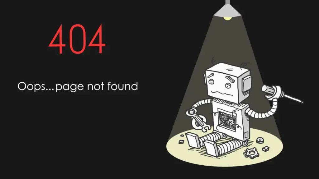
Someone landed on this page by accident. What do you want to say to them? The best landing pages are ones that make light of the situation. Do something more than “This page doesn’t exist.” Acknowledge that there was an error, apologize. Depending on your target audience, you could include a funny image or funny message about the error.
Give them tips for finding what they want
They were looking for something when they landed on that error page, so try to help them find it. One of the first things I like to do is include a search box on the error page, so people can try to search for what they need. You might also include a list of popular pages and a button back to the homepage.
Suggestions
If you are using Google Analytics, you probably already know what pages or posts on your site tend to get the most traffic. Why not suggest those posts or pages as places your visitor might want to go?
This is also a great place to include a short blog post grid showing your most popular blog posts. You could do the same with events or other data that is popular on your site.
Contact Information
Even if you’ve done all you can to help your lost visitor find what they are looking for, the answer may be that they just need to contact you. Don’t forget to give them information on how to get in touch. You can link to your contact page, you can put your phone number with a CTA. This is especially important if your goal is to get contacted by potential customers. Why wouldn’t you provide this information on an error page? You’re missing out on lots of opportunities by not keeping it on here.
An error page is an often forgotten but not unimportant part fo your online presence. Set up a good one! Or contact us to do it for you.

Amy Masson
Amy is the co-owner, developer, and website strategist for Sumy Designs. She's been making websites with WordPress since 2006 and is passionate about making sure websites are as functional as they are beautiful.