

A couple of years ago, we had a thing in our tech world we called “Mobilegeddon.” What this meant was that websites were going to start getting penalized in the Google searches if their sites weren’t mobile friendly. This is a big deal. More and more people are viewing sites on their phones, so not having a mobile-friendly website is important not just for your search engine rank, but also for your user experience.
At the time, Google also implemented a little tag that would show when you do a search on your phone, letting you know if the site you were thinking of clicking on was mobile-friendly.
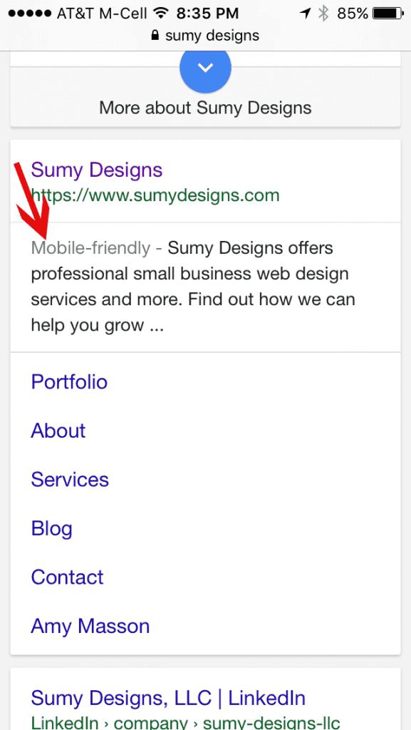
Google was really taking this seriously at the time. And I try always to listen to my Google overlords, so we did what needed to be done not just for our site, but for all new sites we were making. Fast forward two years and Google is still using mobile-friendliness as a ranking factor, but now they are dropping the “mobile-friendly” on tags, because hooray, about 85% of all websites in the index are mobile-friendly. The tag is no longer needed.
This doesn’t mean much to most of us in the long run – your site will still be judged on mobile-friendliness in Google, but there will be more space for your site description now. Not sure if your site is mobile-friendly? You can always use the Google mobile-friendly testing tool to check and see. If you use Google’s webmaster tools, you can also check out the mobile usability of your site there, which will alert you to any pages that might not be passing the test.
My site looks fine on my phone, but doesn’t pass the test. What’s up?
There’s a big difference between being able to view a smaller version of your site and having a mobile-friendly site. I have a lot of people come to me with sites and when I tell them it’s not mobile-friendly, they say, “What do you mean, I can see it on my phone fine!” Well, yes. Most sites will load up on your phone but if it’s just a tiny version of your desktop site, then that’s not mobile-friendly. That means we probably need to zoom in to read the text and move the page around on the phone to find things, and probably it’s hard to select items from the navigation because they are too small for our fingers to hit. It’s not a good user-experience.
Bottom-line: If your site isn’t mobile-friendly, you need to make it so. And soon.

Amy Masson
Amy is the co-owner, developer, and website strategist for Sumy Designs. She's been making websites with WordPress since 2006 and is passionate about making sure websites are as functional as they are beautiful.