This week, I’m writing all about political websites and when it comes to the issues, I have a lot of opinions. But don’t make the mistake of thinking I’m going to be lecturing you on the actual issues. Today, I’m just here to talk about how to add your issues to your site in a way that’s user-friendly and easy to read.
What is the Issues page?
If you are running for office, then you probably have issues you want to address when you take office. Depending on what you are running for, those issues could run the gamut from local political issues like drainage to highly emotional issues like gun control. You will need to make your positions clear on your website.
However, these pages can be really quite long and wieldy if you don’t plan to organize your content effectively. Imagine a long page with all your issues one after another. It would be hard to find the topic that someone is interested in, and probably boring to read. So how do you set this up in a way that is user-friendly and not boring? There are actually many ways to do this depending on how much content you have to share. If you are running for a local office like school board, your issues content might not be that long. If you are running for a bigger state or federal office, you might have a lot more to say on the topic.
Ways to display the issues
Accordions
An accordion on a website is a user interface element typically used to organize and display content in a collapsible manner. It consists of a series of sections, each containing a title or heading and corresponding content. When a user clicks on a section’s title, the content expands or collapses, revealing or hiding the information within. Accordions are commonly used to present FAQ sections, product features, or any other content that benefits from a compact, space-saving format that allows users to easily navigate and access information. They’re especially useful for mobile optimization and organizing large amounts of content on a single page.
These are good for issues because it allows people to easily scan your list of issues and pick the one they want to learn more about. Here’s an example:
However, if you have a really long list of issues, or your issue content is really long, then this might not be the ideal display for your issues.
Tabs
A tab layout is a navigational element used on websites to allow users to easily switch between different sections of content. They function similarly to file folders in a filing cabinet, where each tab acts like a label for a specific category of information. Here’s an example of similar content in tabs.
Lorem ipsum dolor sit amet, consectetur adipiscing elit, sed do eiusmod tempor incididunt ut labore et dolore magna aliqua. Faucibus in ornare quam viverra orci. Nulla porttitor massa id neque aliquam vestibulum morbi blandit. At consectetur lorem donec massa sapien faucibus et molestie. Cursus in hac habitasse platea dictumst quisque. Adipiscing elit ut aliquam purus. Id cursus metus aliquam eleifend mi in nulla posuere sollicitudin. Bibendum ut tristique et egestas quis ipsum suspendisse ultrices gravida. Suscipit tellus mauris a diam maecenas sed enim ut. Odio ut enim blandit volutpat maecenas. Mi tempus imperdiet nulla malesuada pellentesque. Imperdiet proin fermentum leo vel orci porta. Neque convallis a cras semper auctor neque vitae. Eu turpis egestas pretium aenean pharetra.
Lorem ipsum dolor sit amet, consectetur adipiscing elit, sed do eiusmod tempor incididunt ut labore et dolore magna aliqua. Faucibus in ornare quam viverra orci. Nulla porttitor massa id neque aliquam vestibulum morbi blandit. At consectetur lorem donec massa sapien faucibus et molestie. Cursus in hac habitasse platea dictumst quisque. Adipiscing elit ut aliquam purus. Id cursus metus aliquam eleifend mi in nulla posuere sollicitudin. Bibendum ut tristique et egestas quis ipsum suspendisse ultrices gravida. Suscipit tellus mauris a diam maecenas sed enim ut. Odio ut enim blandit volutpat maecenas. Mi tempus imperdiet nulla malesuada pellentesque. Imperdiet proin fermentum leo vel orci porta. Neque convallis a cras semper auctor neque vitae. Eu turpis egestas pretium aenean pharetra.
And then, there’s my favorite way to display content, and that’s in a Grid.
Grids
A grid layout on a website is basically an invisible scaffold that helps organize and structure the content on a webpage. Imagine it like a set of rows and columns, kind of like a chessboard, that guides where things go.
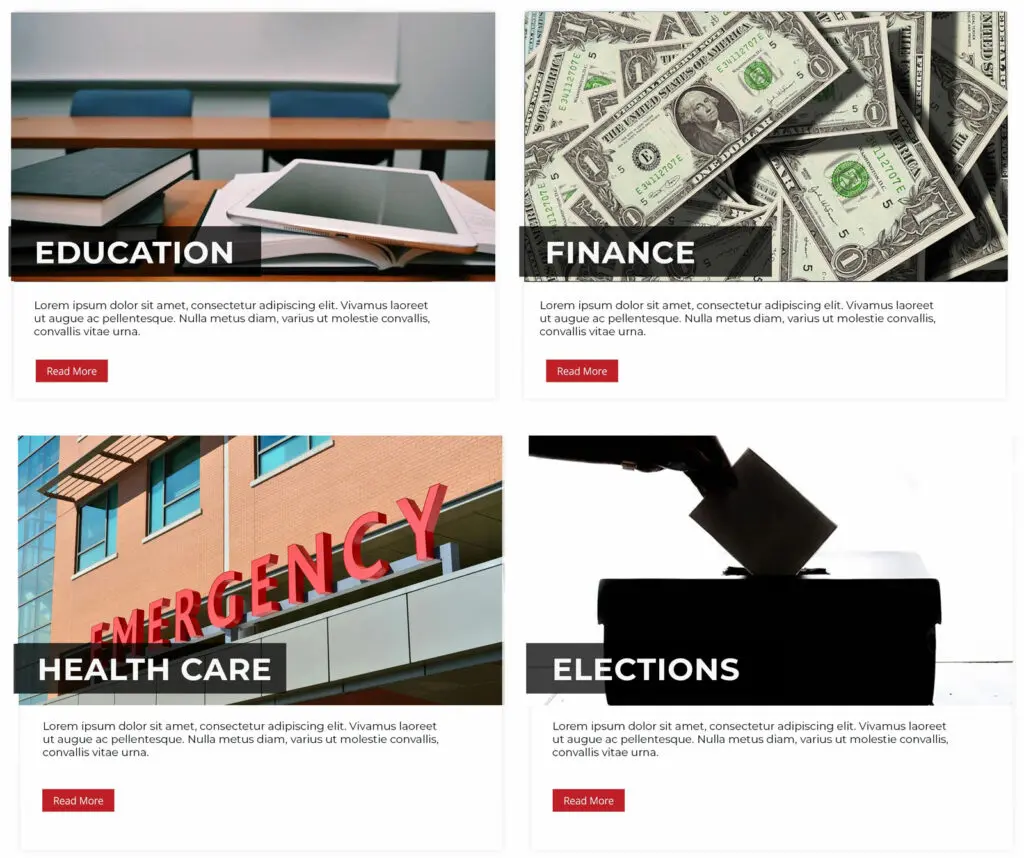
This is a good layout option if you have a lot of content for your issues and you want people to be able to jump to the specific post about that individual issue, rather than see all the content on the same page. What I like about this layout is that it lets you display a little excerpt or a little bit of content, with the ability to jump to more content you want to display. You can customize the grid to include photos.

What’s nice about a grid is that you can organize your issues visually, and you can even break it down further into broader categories, that the user can then explore as they want. So say you have a lot of education issues you want to include, if I add “Education” as a broader category, then you can click through and find all the related Education issues in one area.
I’ve got this example in two columns, but depending on how many issues you have, you could 3 or even 4 in a row to maximize your space.
Issues SEO
It’s barely a blog post if I don’t touch on SEO here. If you want people to find your content, specifically information about where you stand on specific issues, then it’s always best to have each issue on it’s own post or page.
There are a few of reasons why having content on separate pages can be beneficial for SEO:
- Targeting Specific Keywords: A single page can only effectively target a limited number of keywords. By splitting your content into multiple pages, you can focus each page on a specific subtopic and its relevant keywords. This increases your chances of ranking for a wider range of search terms.
- Improved User Experience: Lengthy content on a single page can be overwhelming for users. Breaking it down into digestible chunks on separate pages makes it easier for users to find the information they’re looking for and keeps them engaged for longer. This can lead to a better user experience, which is a factor that search engines consider when ranking websites.
- Building Topical Authority: In SEO, establishing Expertise, Authoritativeness, and Trustworthiness (EAT) is important. Having in-depth content on various subtopics related to your main topic demonstrates your knowledge and makes your website more authoritative in the eyes of search engines.
This doesn’t mean you can’t still use accordions or tabs that display the content all one one page. What I would recommend would be creating your issues content in a custom post type, and then pulling that content into your site using an accordion, tabs, or grid.
Custom Post Types
In WordPress, a custom post type is a feature that allows you to define your own content types. By default, WordPress comes with built-in post types like posts and pages. However, custom post types enable you to create and manage different types of content beyond just posts and pages.
If you have a political website, setting up an “Issues” custom post type is a must. It makes it easy to organize, update, and prioritize the issues you want, and display them in a variety of ways.
You can use these posts to display collectively in one of the previously mentioned ways, but each content type has its own post, it’s own URL, and is searchable and indexible individually. This is going to create the best opportunities for you to be found in the search engines for each issue, while also creating a good user-experience for your site’s visitors.
Amy Masson
Amy is the co-owner, developer, and website strategist for Sumy Designs. She's been making websites with WordPress since 2006 and is passionate about making sure websites are as functional as they are beautiful.
