
I recently watched a fun SNL video starring Ryan Gosling about how he is still, years later, haunted by the logo for the movie Avatar. Why? Because it uses the font Papyrus. Nooooo!
Every graphic designer’s nightmare is having a client that wants their logo designed using the Papyrus font. So, with that in mind, I thought it would a good time to revisit some of the fonts that 99% of designers agree should be avoided at all costs. Why? Mostly because they are so readily available and so overused that it is impossible to look at them and take them seriously.
There are much more, but here are ten fonts that should be avoided:
#10 Curlz
Curlz was designed in 1995 by Carl Crossgrove and Steve Matteson as a display font to look like bent, twisted metal. Curlz is listed as being appropriate for items like menus, invitations, and signs. But really the only thing Curlz is appropriate for is making your designs look like a 4-year old obsessed with unicorns had full control over your brain.

#9 Comic Sans
Comic Sans was designed by Vincent Connair in 1994 as a casual sans-serif script font. I haven’t figured out how Comic Sans is considered a script font or even how a script font would be classified with a sans-serif font. But until we have an answer this font should be avoided at all costs or you will be the laughing stock of all your design friends.

#8 Courier New
This is a slab serif font that was designed in 1955 for IBS Selectric by Adrian Frutiger to mimic a monospaced typewriter. I’ll give you permission to use this font when the grammar rules change and you can put two spaces between your sentences again.

#7 Times New Roman
I have to be honest with you, I don’t HATE Times New Roman like I hate Comic Sans. Times New Roman is a serif font designed for the British newspaper, The Times, in 1931 by Stanley Morison and Victo Lardent. I give this font some leeway because of its historical significance, but that doesn’t mean you should use it when you have a million better options available.

#6 Bradley Hand ITC
This font was designed by Richard Bradley in 1996. If you aren’t sure why you shouldn’t use this font, go and read Comic Sans again.

#5 Mistral
Designed by Roger Excoffon, Mistral is considered a casual script, or handwritten font, and has been annoying designers since its creation in 1953.

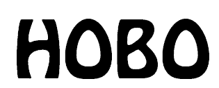
#4 Hobo
Can you believe this font was designed in 1910? Yes, yes you can. And we have Morris Fuller Benton to thank for it.

#3 Brush Script
This is another casual script that is designed to look like handwriting. Robert E. Smith created this font in 1942 for the American Type Foundation. Apparently, the American Type Foundation didn’t think the Hobo font was bad enough.

#2 Zapfino
Zapfino is a calligraphic, formal script font, and was designed by Hermann Zapf in 1998. The 90s were not the best year for font designs, it seems.

#1 Papyrus
Papyrus was designed in 1982 by Chris Costello and is considered a fantasy font. As in, I wish the Papyrus font was a fantasy. But not, I have fantasies about Ryan Gosling.
![]()
Susan Sullivan
Susan lives in the Dallas/Fort Worth Metroplex area with her husband and children. She is an avid distance runner, environmentalist, part-time beekeeper, chicken farmer and amateur photographer.


