

There are probably millions of fonts available to designers today. The large selection is good, because of the variety, but bad because it makes choosing the perfect font difficult. Maybe you are looking for a certain font, but don’t know where to begin? Maybe you just want to tell your designer what style of font you are looking for, but have no clue how to describe the font? In any case, if you want to have a basic understanding of the main styles used by designers today, here is a list for you. I’ve put together common font styles to help non-designers understand the typographical classification systems in our modern world.
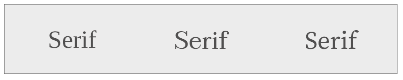
Serif
Serifs are the small lines or “feet” that protrude from the ends of letters. The general rule of thumb is that serif fonts are easier to read in printed materials because the serifs make the letters stand out and become distinctive while guiding the eye across the page. Serifs also increase contrast and spacing. Serifs are common these days in print and online.
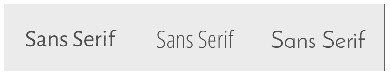
Sans Serif
Sans serif fonts are fonts that do not have the protruding “feet” at the end of their lines. San serif fonts were originally better for web designs because they worked very well at small sizes and are easier to reproduce electronically than serif fonts. With our high-definition and retinal display monitors, serif or sans serif fonts work well for web design. Sans serif fonts are also commonly used often for children’s books because the simplicity of the letters makes them more recognizable to children.
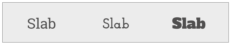
Slab
The Slab Serif has been around for over 200 years and is becoming the new font choice in modern design. The slab serif font has blocky “feet” and is easy to read from far distances. Slab fonts work very well for billboard advertising because they demand attention.
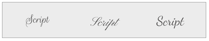
Script
I love a good script font. Script fonts are beautifully elegant and often used for special occasions such as wedding invitations and formal gatherings. These fonts are based on handwritten cursives style of fonts and have very smooth and continuous strokes.
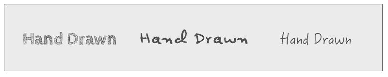
Hand drawn
Hand drawn fonts are fun and can add a ton of personality to any design. Not long ago it would have been unheard of to see a hand drawn responsive font. Not any more, there is a substantial selection available.
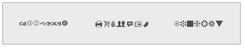
Dingbat
Dingbats aren’t your regular fonts, they are characters and ornamental shapes and even social media icons that take the place of the alphabet keys on your keyboard. There are many choices available and are especially good for those out there who don’t have access to design software
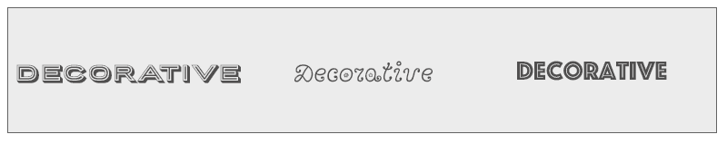
Decorative
These fonts are usually associated with stylized features and are also called ornamental or decorative fonts. These fonts are not best suited for large bouts of text that would be used in the body or in any situation where a reader needs to quickly scan a design.
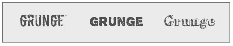
Grunge
Technically, Grunge fonts would fall into the Decorative font category, but with the popularity of this font many font sites have given Grunge its own category. Grunge fonts have a distinct and unorganized look about them and are frequently described as having a dirty look.

Susan Sullivan
Susan lives in the Dallas/Fort Worth Metroplex area with her husband and children. She is an avid distance runner, environmentalist, part-time beekeeper, chicken farmer and amateur photographer.