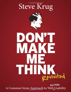
 If you are looking for a great resource on website usability, the book “Don’t Make Me Think: Revisited, A Common Sense Approach to Web (and mobile) Usability” is a great purchase! This is a particularly good book for those who do design but don’t do the development, because it explains WHY certain design elements may not be a great idea on a website, even if they look good.
I know a lot of designers. And they are fabulous. Their eye can’t be beat and they can make things look a million times better than I ever could. I am the function, not the form. But there are things that designers need to know about web usability and this book really hits those nails in an easy to understand way.
This book is a revised edition, the first one was out in 2000, before smart phones and before mobile websites were a thing, so I’m glad it’s been revisited to include what we need to know about mobile.
Let me share some of my favorite thoughts.
People don’t use the web they used to.
Things are different now than they were in 2000. I made my first website in college (cough, back in 1995) and there was no strategy, no planning. Most people didn’t know what the Internet was (and yes, I’m so old that I will keep capitalizing Internet) and those who did were using AOL. Everyone had to think about the websites they were on, because everyone didn’t have a website. Back in 2000, everyone was using large screens. At least, they definitely weren’t using tiny phone screens to look at websites. They weren’t in their cars, they were at home or at work, on a computer. And there was definitely no video.
Now, people expect to be able to find your website, no matter where they are or what they are doing.
The whole premise of the book is that the more your website user has to think, the less likely they are to complete your desired action. If users are overwhelmed with options, they can’t figure out where to start, or can’t tell what’s a link and what isn’t, they are more likely to leave your site before converting.
When you choose to make something that you think is higher end, flashier, more cutting edge over something, for lack of a better word, obvious, than you might be cutting your conversions.
“Making every page or screen self-evident is like having good lighting in a store: it just makes everything seem better.”
People are scanners
I didn’t need a book to tell me this, but judging by how frequently I receive big docs of text for websites, the message hasn’t gotten through. If someone lands on your website, and you’re a business offering products or services, then they have landed on your site for a reason. They are a captive audience. They did not click through on a cat photo or funny meme. They more than likely don’t want to read your PhD dissertation, they are looking for what they need. What does this mean for you?
- Try bulleted lists.
- Bulleted lists are a great way to break up content.
- It makes it stand out.
- It’s easy to find.
- It quickly directs focus.
Don’t make things different than standard just to be unique.
There are a lot of standards when it comes to how people use the web and what they expect, and a lot of website owners are looking to be unique and cutting-edge so they throw in different aspects to be different, like putting the navigation in a non-tradition place. If everyone is expecting your navigation to be at the top, and you put it at the bottom, plenty of people won’t see it. You are only hurting yourself by ignoring standards in favor of “unique.”
This book has loads of great content, and I can’t recap it all here, because you know, I’m not the author and this is just a review, but I want to hit on a couple of points about mobile.
Mobile Usability
When we started using the Internet on our phones (and I was an early adopter of the iPhone) it was so fantastic to be able to use the Internet from anywhere. But at the time, you just got a teeny, tiny version of the website in your phone screen, so it was often hard to read, hard to use, and not super user-friendly.
When it comes to mobile usability, we have to consider trade-offs. People on their phones are going to read less, scan more, and usually have a goal in mind. You probably don’t need the giant hero images on your phone, because that will take up a lot of space that you could be selling yourself.
When you have less real estate, you have to make the most of that space. So get to the point already. Make it easy for your user to find what they want, and eliminate the clutter.
Clutter is awful for mobile! But you knew that.
I would highly recommend getting your own copy of this to learn more about better web usability for your own business.
Amy Masson
Amy is the co-owner, developer, and website strategist for Sumy Designs. She's been making websites with WordPress since 2006 and is passionate about making sure websites are as functional as they are beautiful.
