We recently completed work on a site redesign for Community Yoga. The previous site wasn’t bad, but it was created by someone who has a passion for yoga, not someone who has a passion for websites.

I’ve always said that when you hire a professional for anything, and not just for a website, you are not just paying for their ability to complete the task they were hired to complete, but for their expertise in their field. Yes, I know a lot about the Internet and how to make things on it, but what makes us different is that we understand how people use websites. We understand what they are looking for. We understand how to help them get where you want them to go. What you pay for, when you hire a professional, is that knowledge.
With that in mind, we designed a new site for Community Yoga to meet the needs of their clients – people of all ages and skills who want to learn more about and take yoga classes. What are those people looking for on the website? They are looking to find the class schedule, the pricing, and how to sign up. They are looking to find more about the different types of yoga available. They are looking to see what classes their favorite teachers are teaching and when and they’re looking to sign up online.
Prior to our redesign, this information was somewhat difficult to find. There were no calls to action on the site, leading visitors into specific actions. The navigation wasn’t efficiently organized for user experience, and there was no way to register for classes on the website – you had to jump to their third party provider to do that and the system was clunky and confusing.
We made a point to create a new website that was easy to use. A website that led clients right to the information they needed and provided a super easy way to sign up for classes, buy passes, and engage more with the site.
This site launched on April 16, 2018. Here is a brief overview of the changes we’ve seen in traffic patterns since we launched.
In just three weeks,

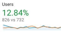
Traffic is up!
Compared to the three weeks prior to the new site launching, more users are coming to the site.

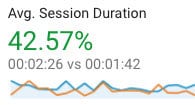
People are sticking around!
People are staying on the site almost twice as long as they were before.

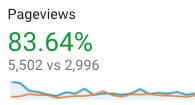
Site visitors are seeing more pages!
This may be one of my favorite stats. Site visitors are seeing over 83 percent more pages than they were before!

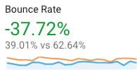
Bounce rate is down!
I know I said the last stat was my favorite, but I think this one is actually my favorite. Less people are leaving the site without an action than before. This is a significant drop in the bounce rate.
These would be impressive stats for any website, but they are more impressive because the site is so new. What this data says is that site visitors are much more able to find what they need on the site. It’s easier to get around, it’s easy to find what they are looking for, and they are doing that. They are using the site to find info, to register for classes and to buy passes.
Getting people to your site is only part of the problem… getting them to stick around and complete an action is important too, and this is often not realized by well-intentioned people who want to DIY a website but aren’t experts in it. This site redesign gave this business the ability to meet and exceed their clients’ needs and the results are clear and evident.
I can’t wait to see how these stats evolve when more time has passed and more users are finding the site.
Amy Masson
Amy is the co-owner, developer, and website strategist for Sumy Designs. She's been making websites with WordPress since 2006 and is passionate about making sure websites are as functional as they are beautiful.
