

A serif font is a font that has a tiny line attached to the end of a stroke of a letter. Here is a list of my favorite serif fonts. Serif fonts work well for print and when used correctly, can work equally well for web designs. Try using one or more of these fonts in your next design project.
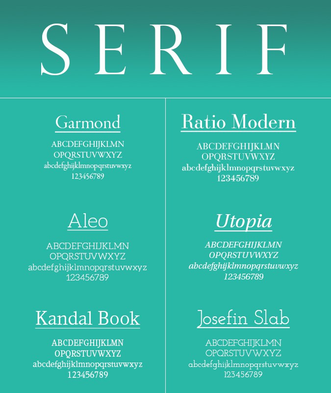
Garamond
Garamond is a classic, old-style typeface that was created by Claude Garamont, often referred to as Claude Garamond. Garamont was a typesetter and punch-cutter in the 16th century and almost all Garamond styles, including the Adobe version which I’ve used in the above sample, are based off of his original work. Because of its clear lines and spacing, Garamond is a favorite among authors and journalists. A few of the other versions of Garamond include: Monotype Garamond, URW+ Garamond, ITC Garamond, Sabon and Garamond Premier. You probably already have a version of Garamond in your font library, but if you are looking for the Adobe version you can get a copy through Adobe Typekit.
Ratio Modern
This typeface was created by Friendrich Kleukens in the 1920s. Ratio Modern was also one of the first metal typefaces used in mass publishing. I really like this font because it looks like a cross-over between a very modern font and a very retro font style. This font is available for purchase through MyFonts.com or through Typekit.
Aleo
The Aleo font was designed by Alessio Laiso and I downloaded through Font Squirrel. I am drawn to the sleek lines and contemporary slab feet. Aleo has excellent readability and works particularly well as a heading or accent font.
Utopia Std
Utopia is an original Adobe typeface that was designed by Robert Slimbach in 1989. The variations of this font give it priority when used as a headline or when numbers need highlighted. The high contrast of the strokes allow you to use this font to stress certain properties in a contemporary style. This font is available from Adobe.
Kandal Book
Created by Mark Simonson in 1994, Kandal Book is an angular font that boasts uniform strokes. This font is technically considered a slab-serif but its style is similar to an old-style serif. A fun fact about this font is it named after a town in Norway and rhymes with ‘bundle.’
Josefin Slab
This font follows the geometric style of the fonts designed in the 1930s. It has a slick appearance with a very distinctive slope on the “e.” You can download this font from Google Fonts or through Font Squirrel.
![]()

Susan Sullivan
Susan lives in the Dallas/Fort Worth Metroplex area with her husband and children. She is an avid distance runner, environmentalist, part-time beekeeper, chicken farmer and amateur photographer.